

Our latest update to improve the user experience in Guru is related to the lists of Cards that appear on the search results page and the dashboard in the web app.
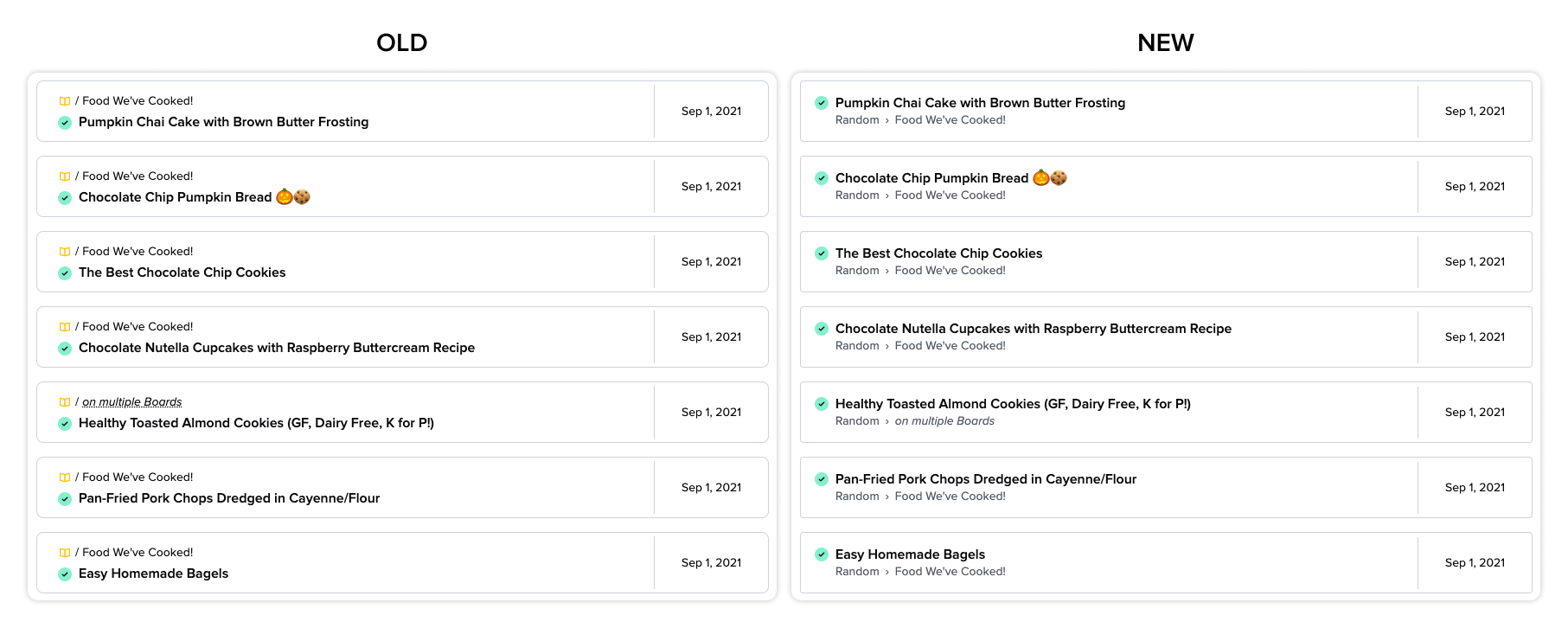
When reading lists, it’s important for information to be as scannable as possible. That’s why with this update we’ve reorganized the Card preview: prioritizing the title and verification status, removing the colored Collection icon in favor of displaying the full breadcrumb, and refining font sizes and colors.
Here’s a comparison of the changes as they look on the dashboard:
On the accessibility side, we’ve improved the ability to navigate Card lists using a keyboard and added information to the HTML structure behind the lists so they are easier to consume through screen readers.
This is the first of several updates coming to the search results page over the next few months, be sure to look out for additional updates in this area. Note that you’ll need to refresh any Guru windows you may have open in order to see these changes reflected.
We hope you find these changes helpful, please let us know if you have any questions!