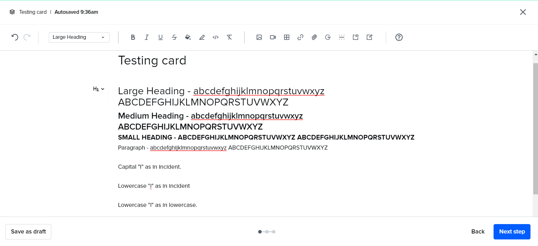
It’s very frustrating to have lowercase “i” show up as very similar to uppercase “i” and lowercase “L”. Is there a way to change the default font in Guru? See screenshot for an example.

It’s very frustrating to have lowercase “i” show up as very similar to uppercase “i” and lowercase “L”. Is there a way to change the default font in Guru? See screenshot for an example.
Best answer by Callie Rojewski
Hey
If you have time, please share this in the Product Feedback area. You can also add a link to this thread so it’s easy for everyone to understand what led to the feedback. In the product feedback section you can also add your vote to other feedback, discuss feedback with other customers, learn about the various changes we’re considering for Guru, and engage directly with our Product team.
I did a quick search and found some former threads on font feedback, including this one:
Please let me know if you have any other questions, good luck!
Enter your E-mail address. We'll send you an e-mail with instructions to reset your password.