Did you attend one of the Custom Pages workshops recently? Have you been tinkering with Guru’s new custom pages feature?

We’d love to hear from you! Show off what you’ve built—your creations could inspire others to help elevate their team’s overall knowledge experience. 🛠️✨
 

🤔 Here are some additional questions to spark discussion:

  1. What creative use cases have you found for Pages so far?
  2. How has this feature simplified navigation for your team?
  3. What tips or tricks do you have for designing a standout Page?


Drop your thoughts, screenshots, or ideas below ⬇️ Let’s keep the inspiration flowing! 🚀
Read more about Pages in our Help Center here.

Hi ​@Hillary Curran we cannot wait to publish our ideas on Pages! Some use cases we are planning on implementing at the moment are 1) Incidents page to gather all incidents our agents need to be aware of in order to minimize the noise from announcements and 2) Newsletter page with giving different stakeholders the option to add content related to their area, allowing our team to gain back some time we would normally spend to create the newsletter from top to bottom.

What I’m struggling with is the banner - I create custom banners in Canva and I have to move the graphics and text around, download it and crop it several times before it looks as intended on the page. Also, it then looks good on the 13’ inch MacBook screen but when I open the page on any other screen, the banner looks different, changes size, is not visible as intended and is even blurry - we need it to be responsive so that it looks the same regardless of what screen we view the page on (we have users with screens from 13’ to 27’). 

What are the recommended dimensions of the banner? I do not mean the 16:3 ratio, we need the exact dimensions in px.

Thanks!


YAHOOOOOOO! I learned so much at the workshop and am excited to share a feature request. 

We would love to create a verification score that can be specific to the custom pages. For example, we are going to create and R&D custom page and we would love to say ‘of only R&D content, this is our verification score’. Or even have a friendly competition across R&D teams : Product verification score, Engineering verf. score, and UX verf score all listed on the homepage! 

:) 


Hi ​@Lucia Delicova,

I love the ideas you’re working on for Pages—your Incidents and Newsletter use cases sound like such a great way to streamline communication and save your team time. Kudos for diving in and getting creative with Guru! 🎉

About the banner / header image: I totally understand how tricky it can be to get it looking just right on different screen sizes. A few tips to help:

  1. Keep it Simple: The header image is best used to showcase your brand’s colors, patterns, or visual style. Think of it as a way to add flair to the page. Any text or important info should live on the page itself to ensure it’s always readable.

  2. Responsive Design: The header image acts as a responsive viewport for an image, meaning its appearance will adjust dynamically across different screen sizes. To make sure your design works everywhere, avoid placing key elements near the edges, as they may get cropped or scaled differently.

  3. Start with the Right Size: In Canva, create a design and start with a custom size of set 1900x360px and download as a PNG without compression. Within the header image, focus on the 1500x190px safe zone for key design elements to ensure they’re always visible. Avoid re-cropping or resizing after downloading, as that can degrade the image.


  4. Safe Zone for Design: Keep key elements (like logos or graphics) within the 1500x190px area while leaving space for the search bar, which is centered. Use the rest of the header image for decorative or background elements.

To help illustrate this, I’m attaching an image that highlights the safe zones and dimensions. 


Hope these tips and the visual guide, helps create a header image that looks great and works well for your team. Let me know if you’d like more guidance—I’d be happy to help!

Can’t wait to see your Pages in action. Please share! the team would love to see them 😊


Hey ​@Johanna Evans Thank you so much for these tips, this is exactly what I needed! 🙏 I’m saving your tips to our guidelines so we always apply this and I’ll share later what I’ve come up with 😊


Keeping the inspo going 💫

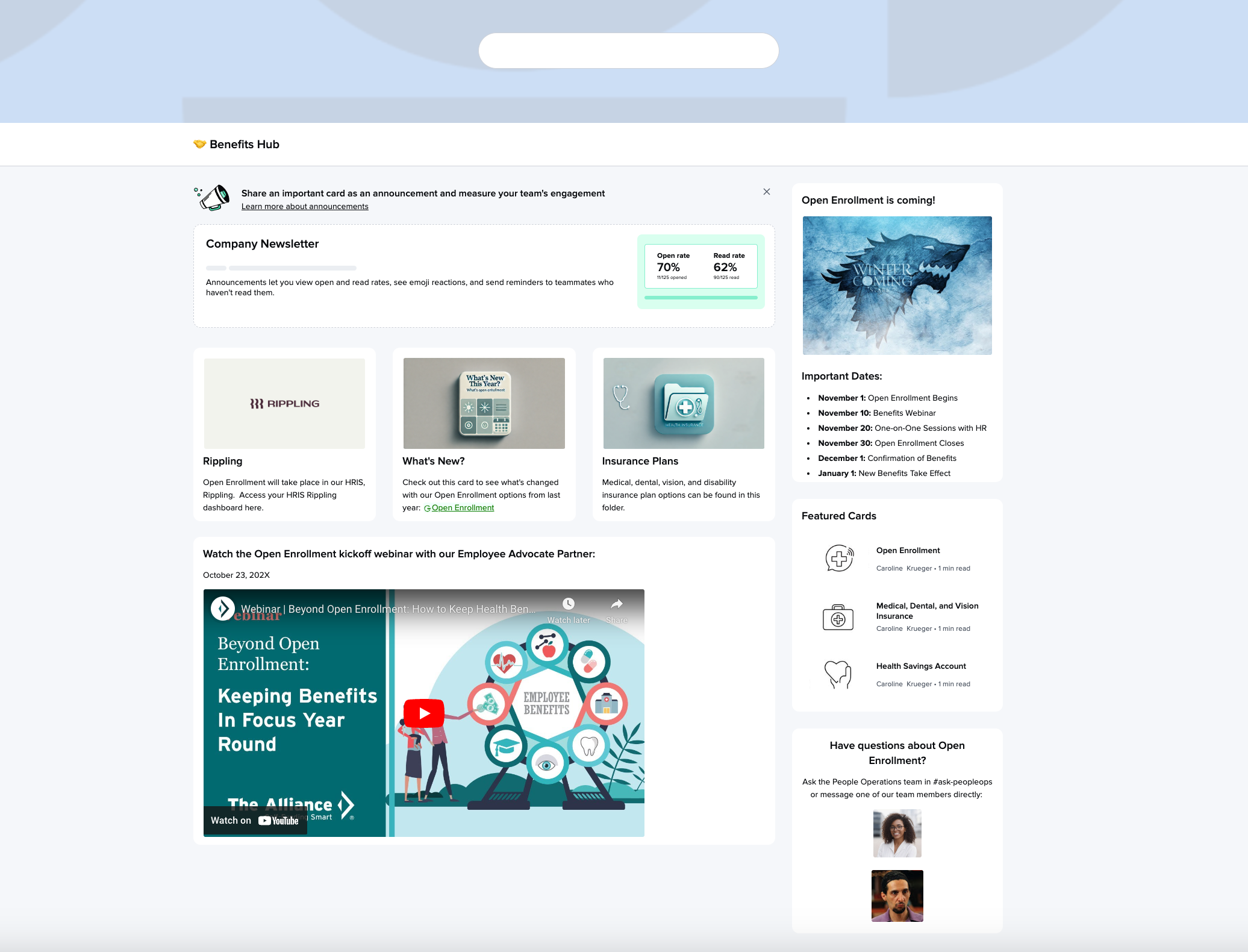
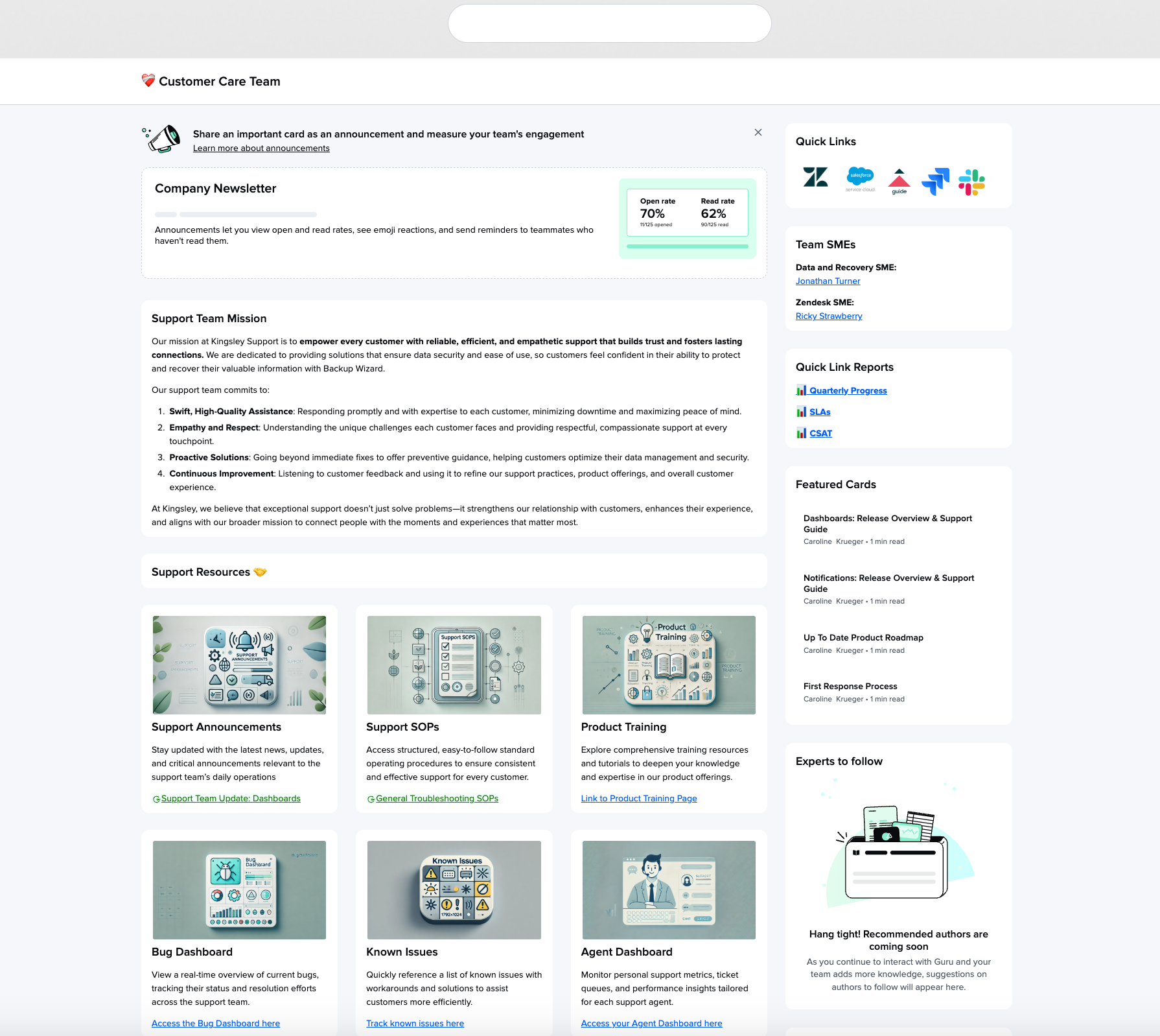
Here are a few examples. Keep threading any screenshots you want to show off! 🎨


Do you have examples of page designs for various teams?  We’re working on setting this up but seeing real life examples for a home page and team pages other than HR/benefits would be great


@Ash Todd Thanks so much for the question. Very excited you’re diving into Pages! What team pages are you wanting to build? You can see in the Customer Care example Caroline posted above, most team pages we’ve seen highlight things like:

  • Top team resources for easy access - i.e. Drive links, Guru Cards, etc.
  • Quick links to team-specific applications 
  • News & Announcements - if you use Guru announcements these will automatically be featured at the top of the page
  • Mission / Vision / Goals 

If you think about your team page as a newspaper, you want to feature the most important headlines for your users. Also be sure to think about the frequency you want to update these pages as that will influence what you feature. (As such I recommend leveraging Guru’s native content blocks like “Featured Cards”

We’re hosting a 2nd Pages workshop next Thursday so if you can join would love to see you there -- we will definitely walk through more examples. 


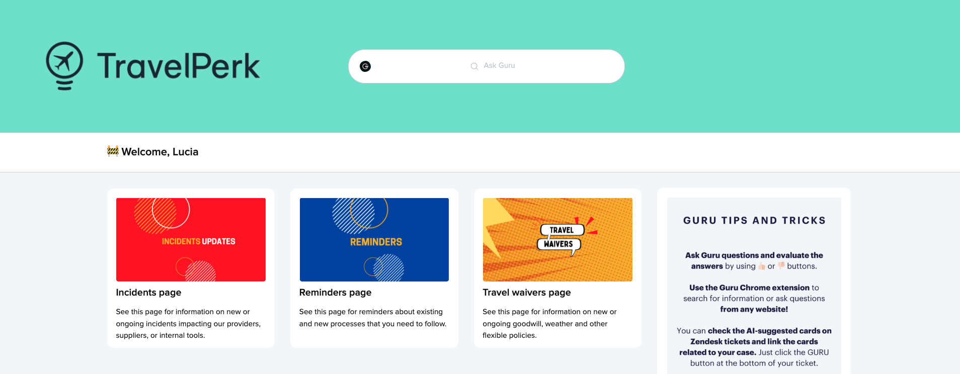
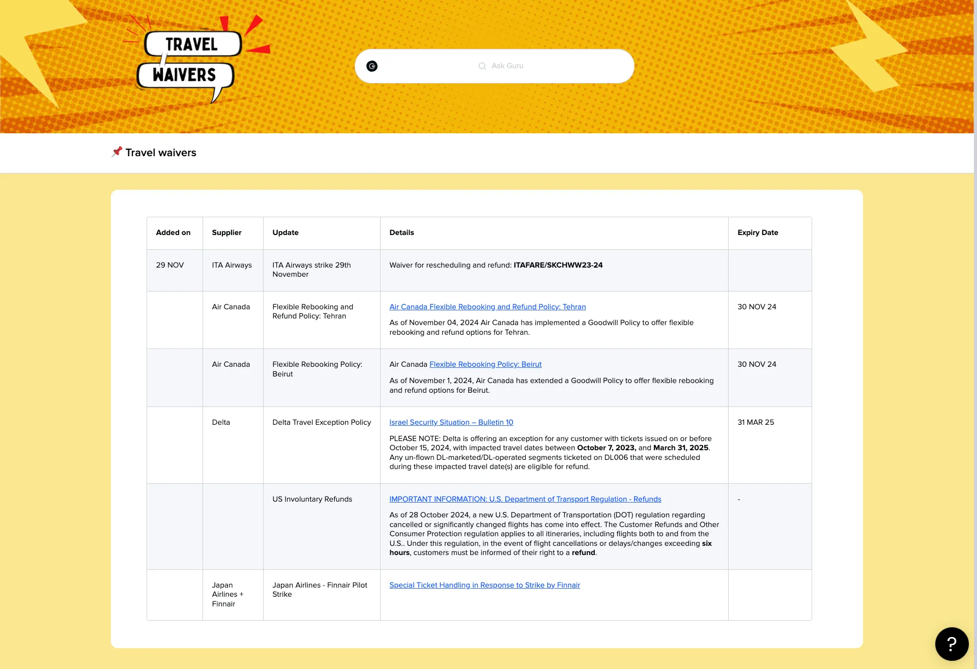
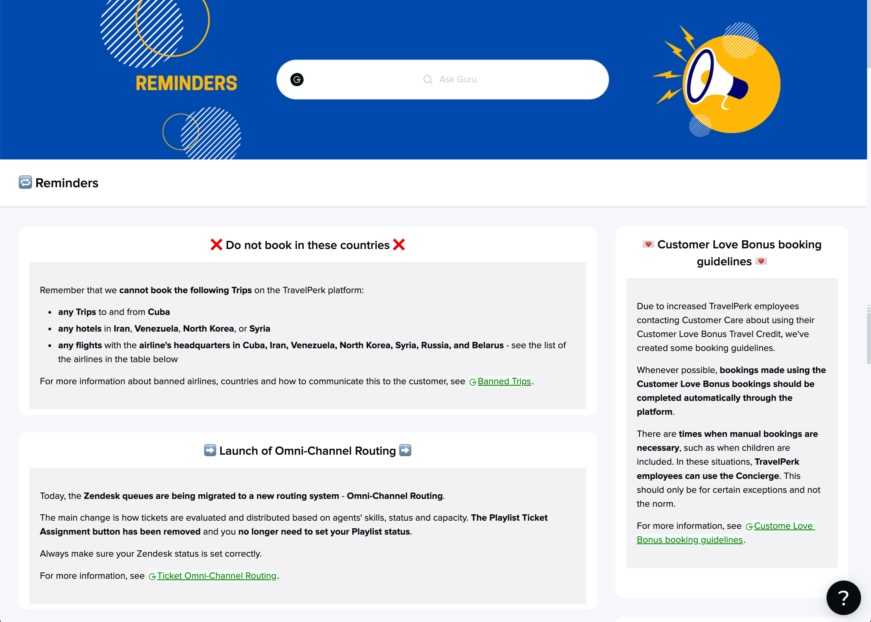
Hi everyone! We already have our main homepage up and running for about two months now. As we’re seeing a lot of potential and we don’t want the homepage to become cluttered with too many information, we are planning to release 3 new pages next week! That way, we will be able to declutter our homepage and also allow agents to find the most relevant updates they need faster. I’ll show you below :) 

On our homepage, we will have sort of a ToC. We plan to set Guru Homepage as a default Chrome homepage for all agents, meaning that this is the first thing they will see upon opening Chrome. 
 

Main homepage design with the ToC of the separate pages. 
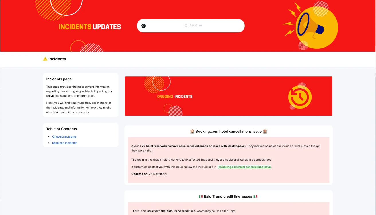
Incidents page to gather the critical updates. We hope to eliminate the amount of announcements we send out and make it easy for agents to see what’s going on.
A dedicated space for the Disruptions team that will be fully managed by them since we can give them editing rights just for this page. 
Page to gather reminders about processes that we see agents sometimes forget or struggle to follow.

@Johanna Evans thanks again for your tips, they made my life so much easier! I can design the banners much faster and they look great on different types of screens not affecting the quality ☺️


Reply