Thanks @Ashley Gordon
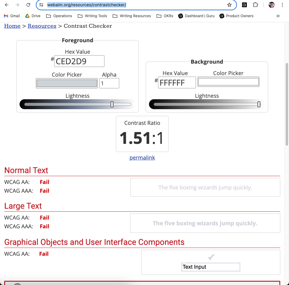
The color you’ve identified looks to be the light gray box in front of the text. The default font color of the actual text looks to be #717780 which passes WCAG AA with a 4.51:1 ratio.
Is that color you’ve identified used for the actual text somewhere? If so we will change it.
Hi @Mitch Stewart ! You’re correct that I used the gray box that appears ahead of the text - I did so because the two colors looked identical to me. I just zoomed in to 200% on my browser to take a sample of the block quote text, and it does pass with the ratio you cited. However, I don’t think it changes the fact that I still find this color immensely difficult to read. I have 20/20 vision (promise it isn’t a brag) and if I’m finding that color difficult, I can’t imagine what it’s like for folks with low vision. I hope Guru will consider making this color a bit darker even though it passes 4 out of 5 levels of testing on the contrast checker. Moving the contrast to be a little darker will ensure the font color passes the contrast checker with flying colors, and will ensure it’s easier for everyone to read.

