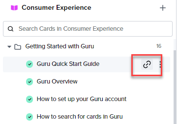
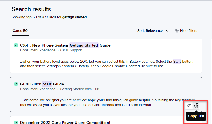
Problem: Change to UX/UI with the links and favourite icons moved to the top right resulted in further distance my mouse has to move to share information ultimately negatively impacting my efficiency and increasing the amount of mouse movement & number of clicks to accomplish the same task as before.
Problem for: My team who share guru cards regularly throughout our days in Slack support
How do you solve the problem today: Using the markdown chrome extension right click the guru card I have open > Copy as markdown > Paste into Slack > Highlight all text (ctrl+a) > Ctrl + F (converts markdown a hyperlink)
- this can be accomplished using keyboard shortcuts like Ctrl + A to highlight all text, so it’s faster than the mouse clicks required to copy the link of text and type the guru card name/descriptor and attach the hyperlink
- In split screen my mouse is bouncing back and forth between tabs (with slack being on left, resources (like guru) on right tab) and its easier to right click > copy as markdown nearer to the middle of the page where the former icon positions were (in between the two tabs) than the current position at top right.
Ideal solution to the problem: Offer settings that allow us to tailor positioning of the icons where it makes sense for our personal use-case and workflow, and return the one-click copy link option to browser guru.
How big the problem: This impacts every single question I help with, so consistently throughout my 40 hours a week
Note: I understand one-click share is possible in the Chrome extension, but the Chrome extension is too slow and unreliable to use in my workflow. I’m currently chatting with Guru tech support about this, but the recommended sharing the feedback here regarding the browser Guru


