Hello! When you use the collapsible sections and the main text at the top is “normal text” rather than a title, the arrow is set just above the text instead of next to it. Small issue, but it’s not pretty and that bothers me.
Another example
Published view:
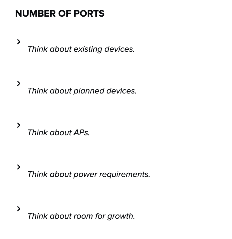
Edit view:
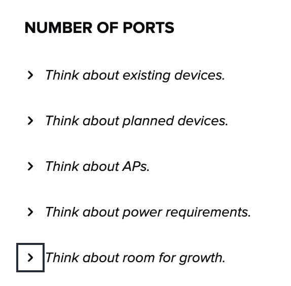
Hey
Any clue why this is still a problem? This seems like such an easy fix and it’s been over a month since you said engineering was looking into it.
Hi everyone! This bug has been fixed, so new line characters should no longer be automatically added to collapsible sections on Card publish. Apologies for any inconvenience this caused, and thank you all for your patience while we worked to resolve it for you!
This is not fixed for me. I just went to my page that I posted the screenshot above and re-published it and it wasn’t fixed. So, I went in and created new collapsible fields for each of the sections (I pasted the collapsed content but I re-wrote the title from scratch just in case pasting would be an issue) and it still has the return line before the text.

This is also a problem for us at the moment — collapsible sections still look wonky even after refreshing pages and retyping them so I don’t think it’s an isolated issue.
We’re running into the same issue.
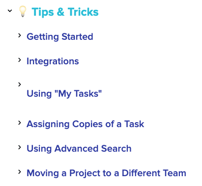
Hey Madison, thanks for sharing this! Since this is only impacting one line, it looks like in this case there may just not be text in the “Title” section of the Collapsible Section. Can you confirm if this is the case? If not, let me know and I’ll follow up with you via email to troubleshoot further!
Hi
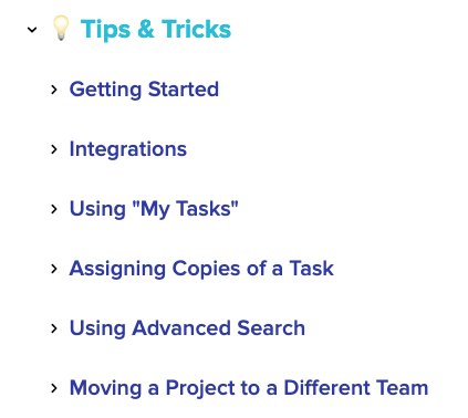
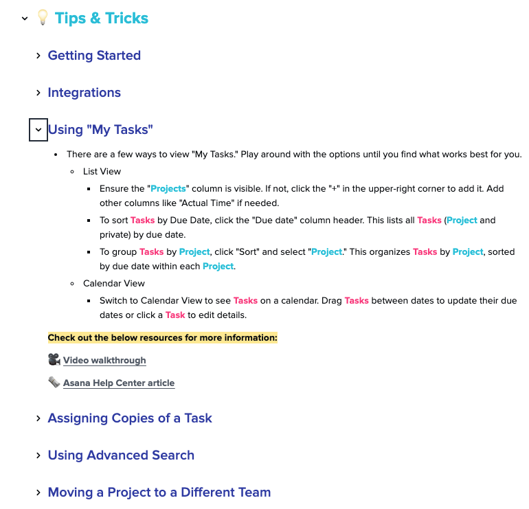
Just bumping this thread — we’re still also seeing the exact same issue as Madisun above. Text is in the title section of the collapsible, but the odd spacing persists.
Enter your E-mail address. We'll send you an e-mail with instructions to reset your password.
