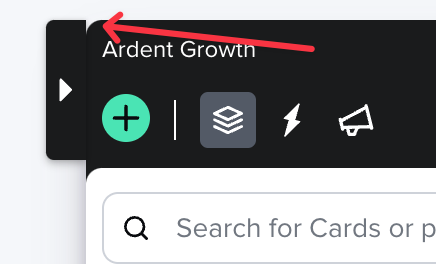
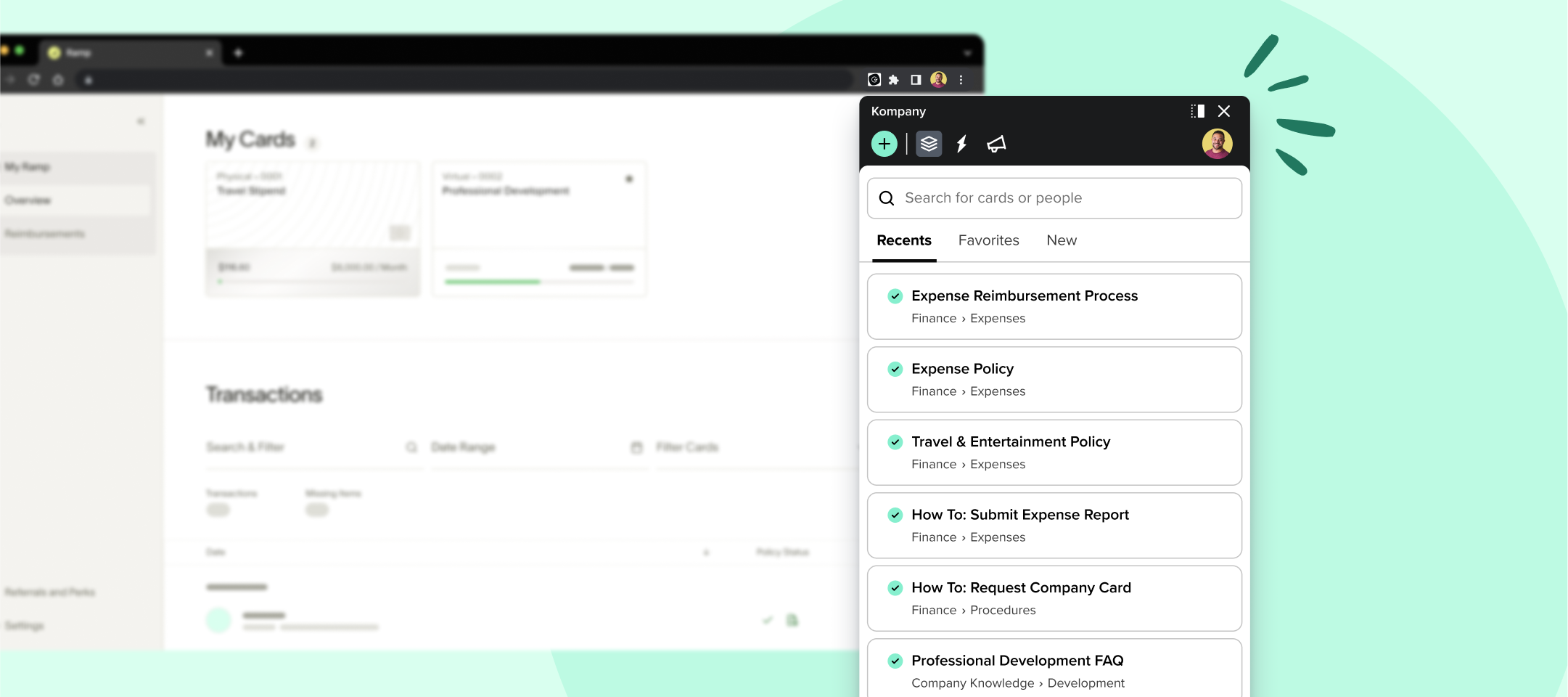
Hey Guru Community! Starting today, you’ll see that the Guru Chrome extension has received an update to make it simpler and faster to use. We see the browser extension as an important part of Guru’s promise to work where teams are already working. That’s why we’ve updated the extension so users can focus on the actions they use most frequently:

  • Creating new cards

  • Search for cards

  • Seeing recently viewed cards, favorites, and new cards

  • Getting suggestions (Knowledge Triggers, pinned cards, AI Suggest Text)

  • Reading announcements


This simplified extension makes room for exciting feature updates we’re currently working on. First up on our priority list is revisiting Knowledge Triggers so it’s easier to push proactive knowledge to your teams over top of the apps they use everyday. More news on that as the work moves forward!


Part of this project has been improving the accessibility of the extension. With this release, you will see improved keyboard and screen reader support within the extension.


As part of the extension redesign process, we took a look at things we could clean up. As a result, some actions have been removed from the extension. Don’t worry–you can still do all of these things in the web app! Here are the actions with very low engagement in the browser extension that have been removed:

  • "Collections" link and icon from the top nav

  • Ability to browse Collections in the extension

  • "My Tasks" link and icon from the top nav

  • Ability to look at and respond to tasks in the extension

  • "More" dropdown from the Cards menu

  • "Ask an Expert" button


If you have ideas for the extension, we’d love to hear from you. Share your thoughts in the Product Feedback area of the Community.

Looks like all previous responses to this were deleted. I’ll be the first to say that you’ve crippled our team’s ability to use the extension; the ability to browse through Collections/Boards was essential.

Just because feature X gets less usage (fewer clicks, less engagement, whatever) does not speak to its usefulness. Our team can now no longer browse through a folder (board) named “Sales - High Value” when chatting with a potential high value client, which is absolutely essential. The ability to do this with the extension rather than the web app was crucial. 

This is not the first time critical functionality has been removed/changed in Guru. Instead of using a data-only approach, you really need to survey users before making changes like this.


+1 @John Aitchison 

The browser extension has been reduced to search and favorites only. My larger concern is the removal of Ask an Expert. I know that has received lower billing in the last few updates, but not being able to get help from the browser extension seems like a miss. Removal of these features will now require additional clicks by users to 1) open the web app and then 2) browse content or request help. 


🖐🏾 Hi Community teammates! 

Wanted to pop in and share that the the capability to filter by Collection is still available to all users. We just opted to remove the filter icon just as we did in the web app. in both places a user can still type ! to pull up the Collection filter list.


Hi @John Aitchison, Marie with Guru here 👋 Your other comment is still visible, it’s just that it was made on the pre-release announcement and not here.

We reviewed your and Abbey’s messages and understand yesterday’s extension update is negatively impacting your team and are sorry for that. With this product update, our team used both quantitative data and qualitative research, including user interviews. We ultimately made the best choice for our long term strategy and the majority of Guru teams. We are also really excited about what the extension changes released today enable us to do with improving the user experience in the extension moving forward. With all of that said, this is not the end of the extension changing.

@Abbey Florence, my colleague @Brad Turner is currently researching and is looking to connect with customers that use the “Ask an Expert” feature. If you’re open to it, Brad can reach out directly via direct message in the community to coordinate time to chat. 

Thank you for speaking up and sharing the context around how it impacts your teams. We are going to keep listening to Product Feedback and communicating with everyone here in the Guru Community.


🖐🏾 Hi Community teammates! 

Wanted to pop in and share that the the capability to filter by Collection is still available to all users. We just opted to remove the filter icon just as we did in the web app. in both places a user can still type ! to pull up the Collection filter list.

This doesn’t solve the problem, at all. All it does is show an unorganized list of every card within a Collection. It does not allow users to drill down into a Collection, then a Board within that collection. 

We ultimately made the best choice for our long term strategy and the majority of Guru teams

If other teams aren’t organizing cards into collections and boards, I’d be absolutely astounded; if they are, then no, you didn’t make a good choice. The browser extension is now just a huge unorganized list of every single card.

Agree with this - really miss the collection view in the previous version of the extension


Looks like you folks left something a little unfinished here. Need to set that `right: 300px !important` you currently have to something more like `right: 294px !important`. Or just cascade things better so you don’t have to use `!important` to begin with.


Hey @Skyler Reeves - thanks for the report, I’ve put this into the bug queue to be addressed!


Hey @Skyler Reeves - thanks for the report, I’ve put this into the bug queue to be addressed!

🙌


Am I missing an easy way to navigate from the browser extension to the web app? Use case: I’m using the browser extension, but I want to use functionality that is now only available in the webapp. Is there somewhere in the extension that is a one click option to open it?


Just echoing what’s been said above: the ability to browse through boards/folders was super helpful feature and without it the extension feels a little chaotic. Our employees use Guru to find information on various customer facing topics and when they are in a live conversation it’s more efficient to browse by topic instead of individual card title.