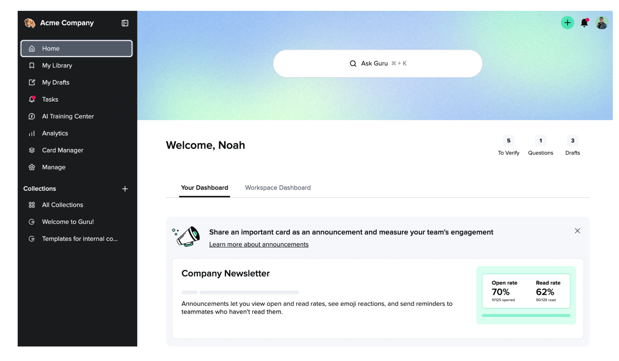
The New Search Experience is Here!
We’ve improved search to shorten the time it takes to find the information you need! In addition to a snappier search, you can now search across all of your connected applications and provide your users relevant results based on their access level. And as I’m sure you may have noticed by now, searching is more front and center than ever with a new header and more prominent input.

Text Alignment options now available in the Editor!
Authors now have the ability to align text to the left, right, center or justified within a Card, callout box, table cell, etc.
Image Linking!
You can now add a link to an image which will open a new tab when the image is clicked. Once added, authors will see the link in the menu bar and have an option to edit the link or pressing a button to remove the link. In "view" mode, this image becomes clickable and will open a new tab using the link provided
Full Width Images and Tables!
Tables and images can now be expanded to be full width so that they expand to be the size of the space it is given! This includes things like call out boxes and collapsible sections.


