Guru’s navigation and hierarchy: simplified and standardized
Hey Community 👋
We’ve heard from our users that the hierarchy of Board Groups, Boards, and Sections can make it challenging to organize your content in Guru. Each level behaves a little differently, and users can’t store Cards at some of these levels.
That’s why as of today today, Guru has migrated all teams to a familiar “foldered” structure. The Board Groups, Boards, and Sections you’ve already created are now folders. This means you can move Cards to any level of the hierarchy–including storing Cards at the Collection level.
This new hierarchy will make it easier to organize your content, as well as making it easier for users to browse and find what they need.
Here’s what’s changed:
Your existing Board Groups, Boards, and Sections have been converted into folders.
Your content hasn’t moved.
You can start moving Cards to any level of the hierarchy.
Collections have an updated, cleaner appearance that removes the Board Group, Board, and Section icons.
The Cards Not on a Board area at the bottom of each Collection has changed:
If you have zero Cards not on a Board, this area will no longer appear.
If you have one or more Cards in this area, it has been converted into a new folder labeled “[Legacy] Cards Not on a Board.” You can move Cards out of this folder and delete the folder when you’re done reorganizing.
The drag and drop experience will be smoother and more consistent.
We’d love to hear how you’re using the new, flexible, foldered version of Guru! Leave a comment here and share your thoughts.
Page 1 / 1
Hi @Omar Carrasco. The improvements and streamlining here are really working well. I have a bit of feedback from my team, but please let me know if I should put in a specific request.
Since we are now required to select a folder before publishing from a draft and since now it lists all the folders at all three levels of hierarchy as options (when previously, you only had to choose from boards but no option to choose from the board group level above or the section level below - I think!), there are so many more options now in where to move it new cards.
To help authors identify quickly what folder a new published card should live in, it would be great if you could see the breadcrumbs for second-level and third-level folders. It’s also possible that teams are using consistent structures in their organization strategy, and keeping naming consistent (see the same 2nd level folder names from my example below Overview and Processes), which make it difficult to know which folder you are placing a card.
Example structure
Compliance
Overview
Processes
Policies
Mandatory
GDPR
Cultural
Overview
Processes
It would be great when choosing from the dropdown list to see the pathway for any folders where another folder is organized above it.
So from the example above, the dropdown would change from:
Compliance
Cultural
GDPR
Mandatory
Overview
Overview
Policies
Processes
Processes
To:
Compliance
Compliance > Overview
Compliance > Processes
Policies
Policies > Mandatory
Policies > Mandatory > Cultural
Policies > Mandatory > GDPR
Policies > Overview
Policies > Processes
I would guess having a more logic based drop down box to filter options based on top level folder selection might also be an option, but this would at least help authors to more clearly see their options better when first organizing new cards. Thanks!
Is there a way I can get this above feedback transitioned to product feedback or should I create a new post? Some more thoughts on how the hierarchy appears in the UI below.
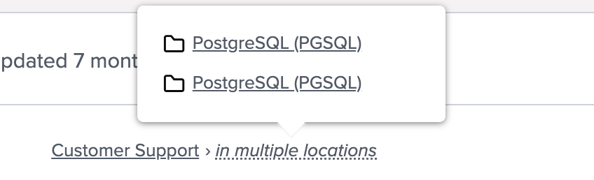
Visible hierarchy for breadcrumbs for cards that live in multiple folders
Additionally, we have been having a similar issue since starting with Guru for cards that live in multiple folders, where the breadcrumbs are abridged and you can’t see the full-path for each location. In the example below, the breadcrumb is omitting the second level folders that have the differentiating names.
Oftentimes our folder hierarchy has identically named subfolders (intentionally) that are differentiated by the parent folder. It would be ideal to show as much of the path as is required to disambiguate similarly/identically named folders. We are big on trying to create some consistency with our organization/naming, but the shortened breadcrumbs in Guru are causing some inefficiencies in trying to guess the right folder (in this example, if a user wants to get back to the desired folder to review other cards organized in the same location).
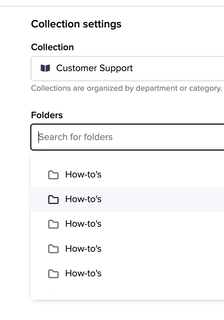
Visible hierarchy when choosing a folder within a collection for a new card
Here is a screen shot from choosing a folder for a newly created card to help illustrate our issue on that too. Guru is only listed the lowest level folder and is omitting a parent folder where the names are distinct.
Let me know if any questions!
@Lynn Miller I have already created a feedback post for the above: