Hello Guru Community 👋
I’m excited to announce Guru’s new navigation. There are times when you need to dive deeper into your company’s shared knowledge. Getting oriented to a project in flight, adapting to a new role, or understanding an updated team structure involves looking at information across multiple Cards, stored in Collections and Boards.
And if you’re an admin or a subject matter expert (or both!), the process of organizing, adding, or moving information should be simple. Your software should work for you, not the other way around!
You go through thousands of micro-interactions with software everyday, and our new navigation is updated to reduce the friction of your interactions with Guru. More intuitive structure, lower cognitive load, smoother micro-interactions, happier you.
That’s why we’re releasing a new navigation experience that makes it easier to see where information lives in Guru (and keep it organized once it’s there):
-
Left sidebar navigation: We’ve rearranged our top nav menu into a familiar left sidebar that gets people to the areas of Guru that are most important, more quickly. Here’s what we love about the new nav:
-
Get to your team settings faster so you can take important administrative actions like managing users, updating your groups, and adding integrations.
-
Easily see your tasks, including an alert notification when you have a new announcement or need to verify a card.
-
And speaking of getting where you need to go, faster…
-
-
Pinned Collections: We’ve added the ability to pin Collections to your left sidebar, so people can customize their browsing experience (and never lose that handy Collection again). Just go to the All Collections link and click the pin on any Collection.
-
We’re using pinned Collections to customize Guru so we can find what we need, faster.
-
This is a great complement to our existing Favorite Cards and Boards feature!
-
-
Collapsible menu: We’ve also made the left sidebar collapsible to give you some extra room to view Collection structure and Card information. Here’s why the collapsible menu is a refreshing change at Guru HQ:
-
We’re using the collapsible menu to free up real estate so we can more easily read card contents.
-
If we need a reminder on the contents of the left nav, we can just expand it, see titles, and collapse it again.
-
Just click the hamburger icon at the top left (next to your company name) and try it out for yourself!
-
-
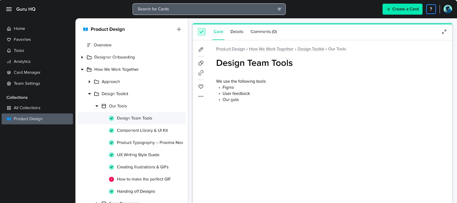
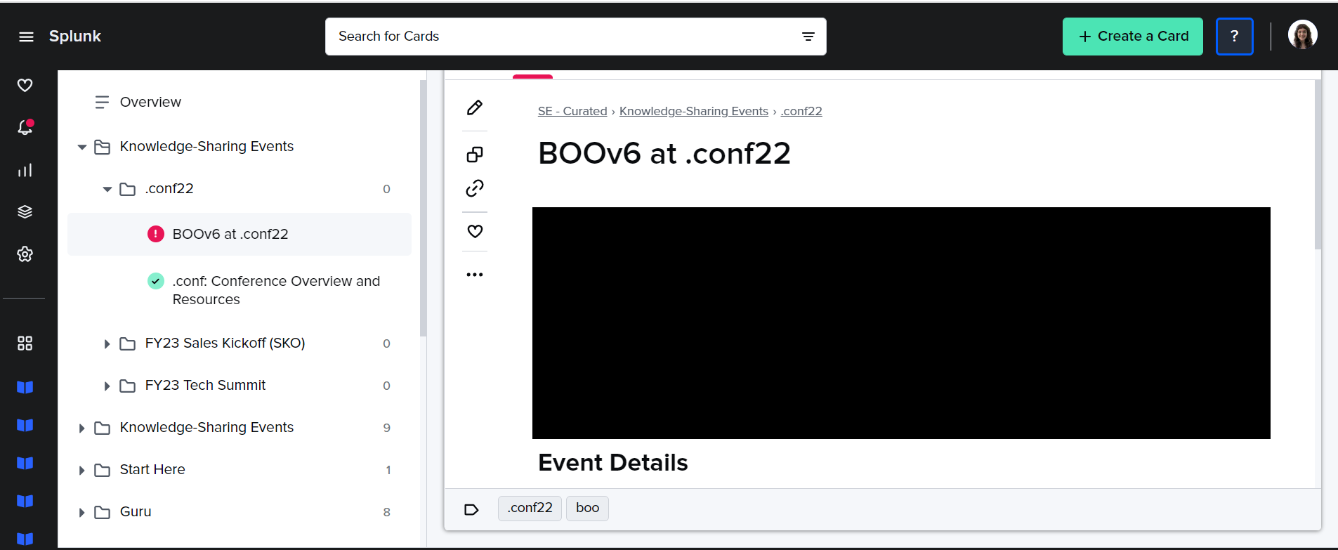
Nested Collection menu: Within Collections, we’ve created a nested menu that helps users see not just Cards, but where they’re located in your knowledge structure. It’s simpler to browse, and easier to consume information. We’re benefitting from the new nested look already:
-
Moving a Board to a different Collection is a lot simpler! Click the three dots next to a Board, and you’ll see a “Move to” option. Select that and you’ll step through the process to move the whole Board and all the Cards within it to a different Collection.
-
It’s a lot easier to add Board Groups, Boards, and Sections. Just click the “+” icon next to a Board Group or Board and you’ll be prompted to add the right kind of content, right where it belongs.
-
Here’s what that looked like before:
-
And with the new look:
-


