

Hi (again) everyone 👋
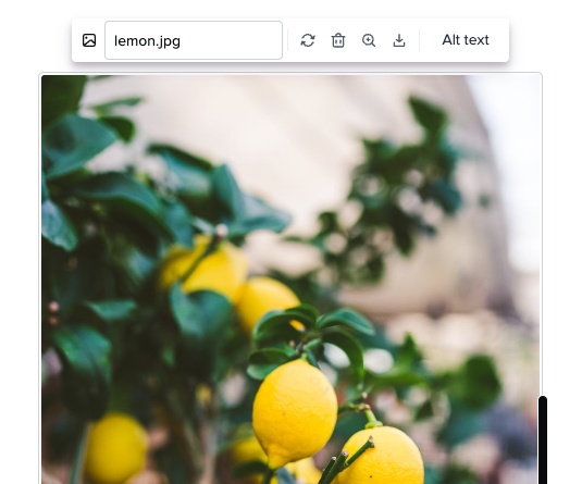
I wanted to highlight a small set of UX improvements that we finished releasing today. With these updates, we’ve improved the usability of the popovers that appear on images contained in Cards. They also clean up confusing icons and buttons and give editors the ability to add alt text without having to use Markdown. If you’ve been keeping a close eye on things you’ll know the alt text update was released a few weeks ago, we’re including it here to make sure more teams are aware of that change!
Here’s what’s changing for editors:
- The download button now downloads images instead of opening them in a new tab.
- Use the magnifying glass button to see the image at a larger size.
- Rename the file by clicking on the name of the file. (The name is no longer a link to view the image at a larger size).
- A “refresh” icon has replaced the pencil icon for when you need to replace the image.
- A new “Alt text” button makes it easy to add alt text to the image for people using screen readers.
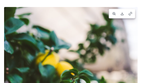
Here’s what’s changing for viewers:
- For most images there will be no popover. The buttons will appear in the top right corner of the image on hover. A popover will appear for very small images where the buttons wouldn’t fit.
- File names will no longer appear because we believe they aren’t useful for most viewers and for cards with many images they can be distracting.
We hope these updates make it easier to work with images in Guru!