Using markdown to create Table of Contents in Guru cards is time consuming, and difficult for new folks to learn. Often folks skip this step, OR when they add a new section to a card, they forget to update the TOC. Would love a solution like Google Docs has where I can easily and quickly convert my headings into a TOC that is updated any time a new heading is added.
Our use case:
While we keep our Guru cards tied to specific topics, they often cover technical topics that can’t be covered above the fold. As a result, folks can miss key resources in a Guru Card because they don’t scroll to read the whole thing or miss FAQ sections at the bottom.
To avoid this issue, we add a table of contents to cards that are more than a few paragraphs. Makes it easy and fast for our team to scan the content of a card and ensure they don’t miss key pieces of information.
Currently everyone on our team creates Guru cards and can edit them (we are making a big push for everyone to document things as they learn them).
Page 2 / 2
It was so obvious for me that a ToCis a part of any rich editor in a knowledge base product during our demos in the vendor selection process. I learned in the help center that you have an alternative for now called anchoring. https://help.getguru.com/s/article/table-of-contents-anchoring
While this provides a temporary workaround, it poses certain challenges, especially for our extensive library of work instructions that cannot be split into multiple cards. I experimented with the anchoring feature, and although it offers some functionality, it requires significant manual effort to maintain, particularly if we aim to update and expand our cards with additional chapters in the future.
For our team, the inclusion of this feature is of utmost importance and a genuine necessity. It would greatly streamline our documentation processes and improve the overall usability and effectiveness of our knowledge base.
In other words, the anchoring feature does not replace the need of a ToC. It’s so tedious that it only creates a higher need for a ToC.
Hi everyone,
Thank you for continuing to raise how critical a table of contents is to your readers' ability to navigate long cards and how the current option of using Markdown isn’t sustainable for authors. With the new editor fully released and other projects like collaborative editing and inline comments well underway, we’ve been able to turn our attention to this and I’m happy to say we’re already working on an update so I’ll update the status of this post! We plan to release this soon!
The solution we’re working on is similar to the TOC functionality in Google Docs, though our version won’t have all the bells and whistles of Google’s (at least to start). Here’s a summary of what you can expect from this effort:
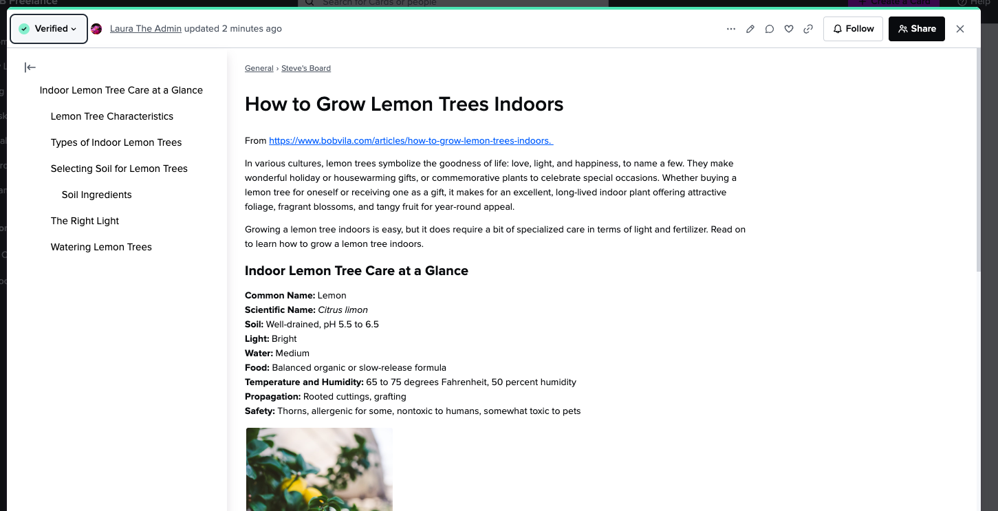
Adding a TOC to a card
The TOC will be autogenerated once a card has more than 1 heading - no more writing markdown to have this type of functionality!
The TOC will automatically update as h1s, h2s, and h3s are added to a card’s content.
You won’t be able to remove headings from the TOC, it’ll reflect exactly the headings in the card. You won’t be able to format the TOC.
Reading a card
For both authors and readers of cards the TOC can be accessed by clicking the new icon in the top left of the card. TOCs will be hidden by default.
The TOC will appear on the left side of a card, next to the content of the card. It’ll overlay the card if the browser window is very narrow or the card is opened in the folder view.
TOCs will work on public cards as well as cards viewed through the extension and web app.
Clicking on a heading in the TOC will smoothly scroll the card to that heading.
Headings will not have their own links so you won’t be able to link someone directly to a specific heading in a card.
When this improvement is released nothing will happen to existing Markdown TOCs, they can be removed as you edit cards.
Screenshots (things may look slightly different by the time we release this enhancement):
The TOC is hidden by default when opening a card.A card in the web app with the TOC displayed.
We’re very excited to get this into your hands, we know it’s been on your wish lists for a long time! Please let me know if you have any questions about what will be included in the upcoming release.
Open→Scheduled
Hey @Laura Desmond-Black,
That looks great! Is there any timeline on when this will be released?
Looking forward to your reply!
Hey @Laura Desmond-Black,
I greatly appreciate the progress your team has made on this topic! However, I do have a concern regarding the potential decision to make the Table of Contents (ToCs) hidden by default for readers. I fail to see the benefit in this approach.
Our diverse employees prefer intuitive usability features and generally dislike having to search for essential navigation elements. Having the ToCs immediately visible ensures easy access to specific sections, improving overall user experience and efficiency. It allows users to quickly locate relevant information and navigate through documentation without unnecessary hurdles.
I kindly request that you reconsider hiding the ToCs by default. Instead, keeping them visible would align with our goal of providing a user-friendly experience, allowing our employees to find what they need with ease.
Maybe you can share what the motivation is behind this direction? If your team is concerned that this would conflict with shorter cards, than maybe the length of the card or number of headings should be automatically be taken into account instead of automatically hiding the Toc.
Thank you for considering this feedback. I look forward to seeing continued progress and improvements on this topic.
Hey @Laura Desmond-Black,
Due to the same reasons I fully agree with Maarten that it should be immediately visible.
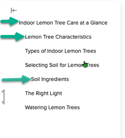
I also want to make sure that the different headings (cq. subjects) are easy to tell apart. Now it looks like H2 and H3 are slightly to the right but that doesn't seem enough to separate the subjects for me. Are they for example collapsible or framed so you make sure which H2/H3 belongs to the H1 (main) subject?
This would be our preference since we want to make sure our user won't mis any information by using the ToC by going directly to a H2/H3 subject when they don't need to for example.
Looking forward to your reply!
@Laura Frencken, very, very soon :) I don’t want to jinx it by being more specific just yet.
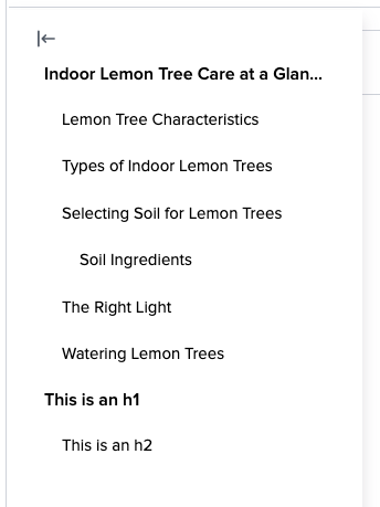
Regarding how different headers will be distinguished, indentation is the big way, though, since the screenshot last week, we’ve also increased the size of h1s to be larger (or whatever level is the highest in the tree in case there are no h1s):
This has been helpful as we’ve been using the TOC internally but we’ll keep an ear out for feedback after release. We considered things like allowing sections to be collapsed and for authors to be able to remove headers from the TOC but all of that would have taken more time and we think this is valuable enough to be released even without options like that.
@Maarten Van der Straeten, thank you for the feedback (Laura too)! I agree there will be times when having the TOC open by default could make sense, particularly in cases like the picture I showed where the card is open in the web app on a large screen with plenty of room around the content. That said many people view cards through the extension or in the knowledge view, or on smaller screens where space is limited, and in those situations showing this type of TOC could have interfered with seeing the card content which we didn’t want to force on readers. We could make the TOC show automatically when there’s room alongside card content or provide user settings to let readers decide for themselves. We could also have the TOC react differently to narrow spaces or pick other criteria to only build when it makes sense as you suggest. All of that would have increased the project size and at the moment we’re focused on a TOC that’s an improvement to the current situation and is something we can build on as we receive feedback. I’ve already subscribed to your post about anchor links :)
Hi @Laura Desmond-Black ,
I completely understand the pragmatic approach to deliver already a big jump forward in improving our user experience and productivity with the ToC. Kuddos to the team for that!
In our case, 99% of all card visits will be via the browser on a laptop or personal PC. I also assume that searching and opening cards via extensions (Slack, Teams, Browser extension, ...), will lead the users to view cards in the browser on a PC screen?
Allowing the TOC to automatically show when there's sufficient space or providing user settings to toggle its visibility would give readers more control over their viewing experience. I hope you can keep an extended improvement on the ToC still on the roadmap.
Hi @Laura Desmond-Black -
I’m so excited for the tables of contents update! However I am a bit disappointed to see this in your note:
Headings will not have their own links so you won’t be able to link someone directly to a specific heading in a card.
Why make it so that you can click on a heading within a doc and be taken to that part, but you can’t hyperlink it so that you can direct someone directly to the content they need? We use Guru as an extensive knowledge base, so being able to point someone to a pinpoint on a card is essential.
Thank you!
Hi everyone,
As you may have noticed the TOC functionality went live a little bit ago. We hope this is helpful to your teams and look forward to your feedback! I’ll update the status of this post to Complete and close comments in a day or two. If there are improvements you’d like to see please make new posts so we can track interest going forward. Thank you!
Hi @Maarten Van der Straeten, the default view when opening cards through the extension is fairly small, though the window can be resized. Same for opening a card alongside the folder list if someone is on a small screen. We’ll keep an ear out for feedback and can consider making adjustments in the future.
@Brooke Cooper, I understand the disappointment. The reason we didn’t include the ability to link to specific headings is that it would have at least tripled the amount of work in the project. There’s a lot more to consider technically when supporting anchors and if we’d decided we needed it for a TOC feature to have any value the project would have been too large to manage alongside our other ongoing work for the authoring experience like collaborative editing, shared drafts, and inline comments. We’re interested in hearing which of the many requests in this thread people are still interested in so please vote on other posts (like Maarten’s) or create new ones for specific changes you’d like to see.