Release Note

Table of contents now automatically added to Cards

Related products: Card Creation User Experience

Hello everyone 👋

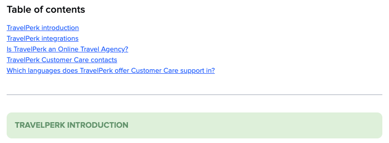
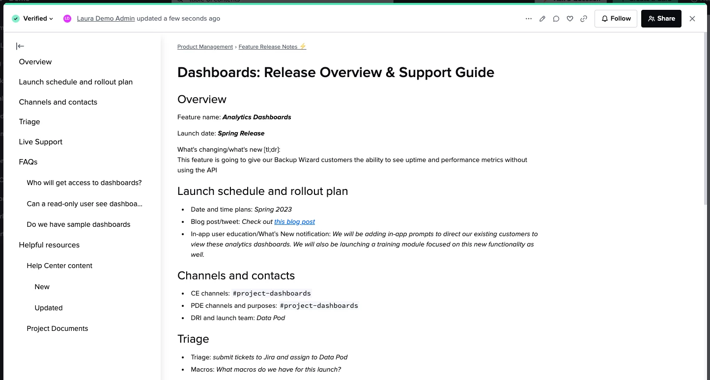
I have a small but mighty update to share: tables of contents can now be automatically added to any Card! You’ve been asking for this feature, and starting today TOCs are automatically added to every Guru Card with at least one heading. This makes your Guru content much easier to navigate, without any extra work for authors. Here’s how it works:

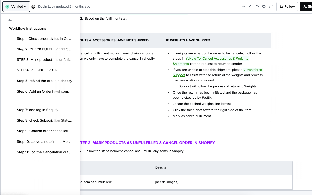
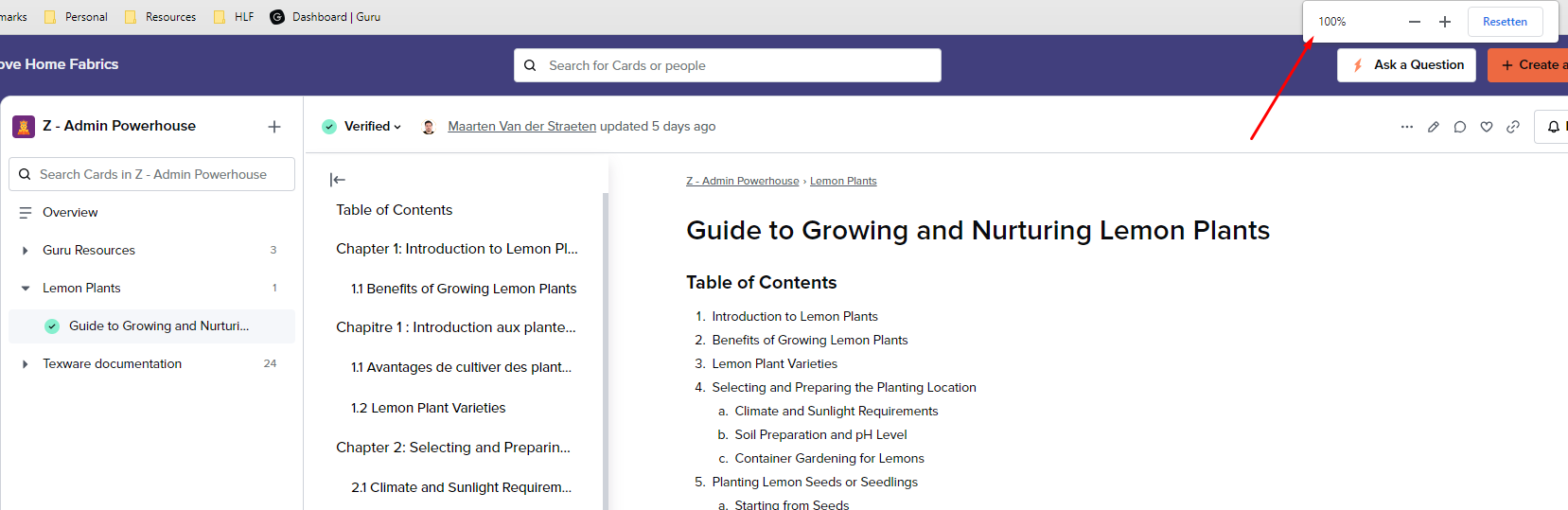
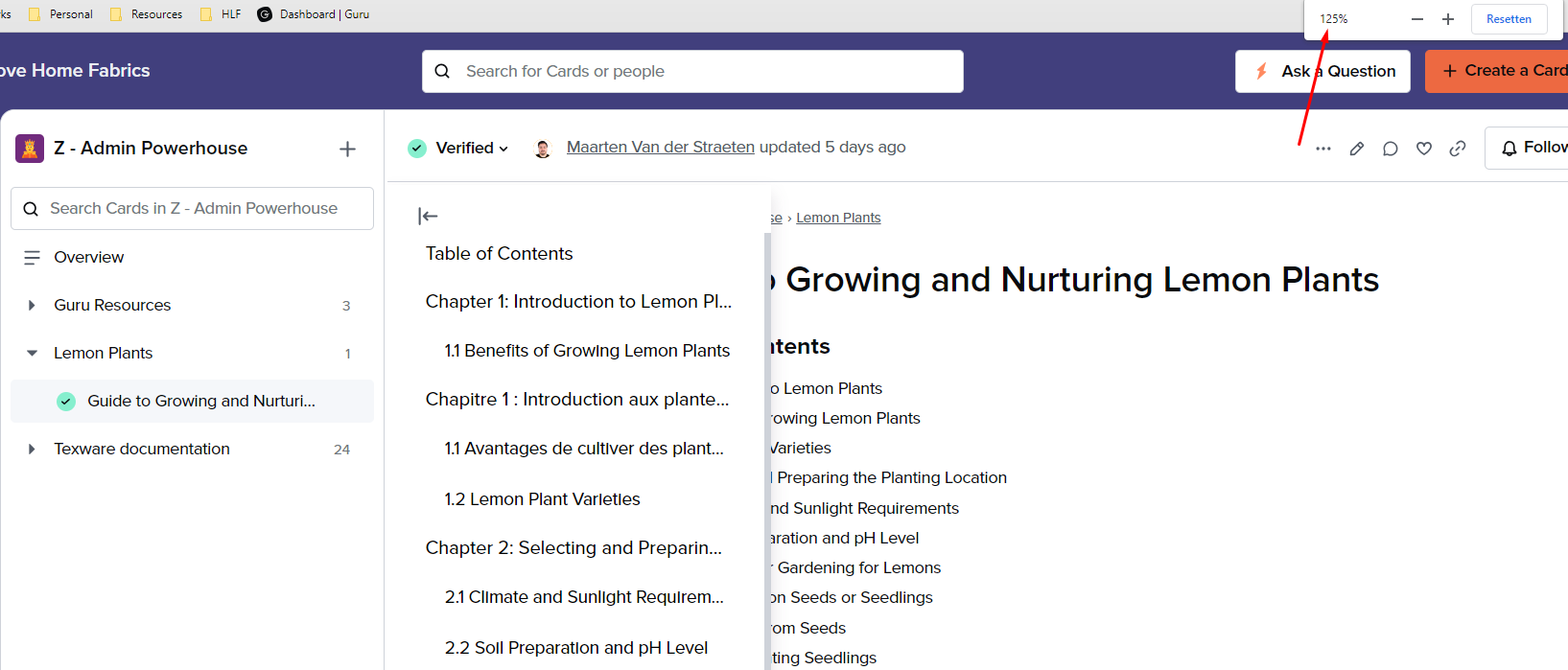
  • Format header text using the Guru text editor and a TOC will appear, with nested levels that reflect the levels of headers in your Card. 
  • Cards that already have headers automatically get TOCs. 
  • Tables of contents are collapsed by default and can be expanded and navigated by readers using the icon at the top left of a Card.
  • TOCs work on public cards.


Table of Contents on a Card in the web app.


See Table of Contents in Help Center for more information about the new functionality. 

We hope you enjoy using these automatically generated TOCs and use the time savings to do something fun this summer!

Note: TOCs will take a few hours to show up on Public Cards. 


Oh HAPPY DAY!! What a fabulous update! Thank you for this, our team has been asking for it for a while now! 


One thing I noticed, when you open the TOC the pop out panel sits on top of the card content so you have to click and close it to see the content behind it in the web app and extension. UX wise, pushing the content over so that you can click through the TOC headings and read the content out to the right would aide in productivity and finding what you’re looking for faster while keeping the TOC panel popped out. 


Hi! This new feature is awesome!

Just a question: would it be possible to also include <h1>, <h2>, and <h3> tags in Markdown blocks?


Hi @Devin Luby, we’re very glad to hear this is helpful to your team!

Hmmm, we expect the TOC to overlay card content in the extension but in the web app “full size” view the content should get pushed over as you describe so the TOC stays open. Could you share a screenshot so we can get a better sense of the space you have? 


@Pierre Segerström, we’re glad to hear that! I’ll make a note to investigate this when we look at making enhancements to the TOC. To confirm you’re formatting the headers in Markdown using # characters?


@Laura Desmond-Black here ya go! 


Thanks @Devin Luby! To confirm is that a card you’re viewing in the web app or the extension? If it’s the extension, is it common for your team to expand cards to that kind of size?

Good news: we have a bug in progress for the issue with fading letters when the TOC overlays a table, we hope to have that resolved before too long. 


Thanks @Devin Luby! To confirm is that a card you’re viewing in the web app or the extension? If it’s the extension, is it common for your team to expand cards to that kind of size?

Good news: we have a bug in progress for the issue with fading letters when the TOC overlays a table, we hope to have that resolved before too long. 


@Laura Desmond-Black confirming that this is on the Web App


@Devin Luby, the extension can influence how cards opened through the web app behave in certain cases (I’d forgotten just how much until I was doing some testing related to this). I wonder if that’s at play here, do you use both? I’ve asked Support to reach out to you so we can investigate further. It might be a bug, or it might be something we need to better account for UX-wise. Either way, thank you for raising this!


@Laura Desmond-Black @Devin Luby 

Could this be related to your browser dimensions/zoom settings? I can replicate this behavior when I change this (see screenshots).


@Laura Desmond-Black @Devin Luby 

Could this be related to your browser dimensions/zoom settings? I can replicate this behavior when I change this (see screenshots).


@Maarten Van der Straeten confirmed that view size had no effect on this, I zoomed up and down in Chrome and the TOC still overlapped the card content. In any case, accessibility wise, even if the window was zoomed, I don’t think you’d want/expect that? 


@Laura Desmond-Black Awesome!
 

There is still no way to do anchor links within cards right? Or can this be achieved using Markdown?


Actually @Devin Luby, this is working as designed for the knowledge view, I was mistaken earlier when I said both places in the web app would push the content over. Yep, I forgot how a feature I helped build worked, not embarrassing at all 😳!! I hadn’t looked at the designs in a while and given my own use on a large monitor, I never experienced the overlap myself. I’m sorry for taking so long to get to that conclusion. We made the choice to have this view use an overlap because we were concerned about how four columns of information being open at the same time would feel (the main nav on the left, the folder list, the TOC, and the card). 

While we’re not ready to make an immediate change, this has been very helpful and we will keep this in mind when we go back to improve the TOC, thank you for raising this and sticking with me!


@David MacVicar, you can still use markdown to create anchor links, the new TOC doesn’t impact that option. There’s some information in our Help Center about how to do that.  


This is great, thanks!

I do have a follow-up request. Could the lines in the ToC wrap?

For example, we have a Security and privacy card with a number of scenarios that have long descriptions and/or start out with similar wording. So in the non-wrapped automatic ToC, it’s hard to find the right scenario. Like, we have two scenarios that start with “Account owner is unavailable,” and that’s all that shows in the ToC. For another one, all that shows is “A free plan or trial account o...”

So we’re still using the manual ToC on this card! But it would great to not have to worry about maintaining it and be able to rely on the automatic one instead.


Love the new TOC feature. It would also be great if we could add our own “bookmarks” so users could jump to a step below and not have to use TOC.  This would be helpful when giving directions and having the user skip a few steps.  This also allows bookmarks to be placed anywhere and not just at section headers.


Hi @BethAnne Freund! That’s a great example, thank you. Not truncating long headings is on our list, hopefully, we’ll get to it soon 😀


We’re glad to hear that @Terry Mullis! What you’re describing with bookmarks sounds a lot like what Maarten describes in this feedback post about anchor links. We’re not planning to work on that kind of functionality in the near term but we’ll keep an eye on related feedback.  


@Pierre Segerström, we’re glad to hear that! I’ll make a note to investigate this when we look at making enhancements to the TOC. To confirm you’re formatting the headers in Markdown using # characters?


I’m using <h1>, <h2>, and <h3>-tags to create headers in our cards. They seem to be treated the same as the Guru Editor’s headers.


Thank you Laura and the Guru team for bringing us this update! Our authors and read only users are equally stoked. This makes has really improved the experience of understanding cards at a high level and navigating cards more effectively.

  1. Personally, I prefer to see the ToC by default, and so viewing it on every card requires 2x the clicks (one to open the card and one to expand the ToC). This adds up fast, especially when hopping between cards. Some solutions/requests:
    • Persist/Previous behavior: Could whether you display ToC recognize previous behavior? E.g. If I open ToC on one card, and I open a new card, the ToC persists and is automatically shown for that new card. Similarly, if I close it, it will be closed by default on the next card.
    • Default setting: Could you add a setting for a user which allows them to choose to open ToC open or closed by default
       
  2. Yesssss, +1 to the request from @Pierre Segerström  - please include markdown headers.

Thanks @Pierre Segerström, I updated the note I have for us to look at headings in Markdown 👍

Hi @Amelia Altstadt, we’re glad to hear your team is happy about this update! A user setting and making the TOC sticky are on our list to look at. I’m not sure where we’ll land in terms of which to do (or doing both) so I’m glad you shared what you’d like to have!


Hi @Laura Desmond-Black  - awesome to hear you’re looking at Markdown as well a setting and/or sticky TOC! Thanks so much for the reply. 


@Laura Desmond-Black I love the automatic ToC, it would have been a life saver a year ago 🙈

Adding to the notes for including the markdown headings in the automatic ToC - some of our cards can be a bit more complex and to make the cards more visually appealing to our users, we’re using the green banner as section headings, plus markdown ToC anchoring each section.

It would be superb if you guys could work this out because we have approx. 800 cards with markdown ToCs and green banner section headings, with approx 1200 users that have been using Guru for over a year now, therefore are already used to our formatting. 

As you can imagine, changing the format from the markdown headings to the standard headings in so many cards and with that changing the style completely is not the experience we really wish to go through 😁 

Just to give you an idea of what I mean by complex cards and how we’re styling it:

Expanded markdowns in the editing mode

⬇️ 

Published card


@Lucia Delicova Wow, really like the styling of your headers. 😮 This really makes the card content more appealing! But I can’t imagine to go through that hassle for thousands of cards. 😅 Maybe a good idea to raise this as a product feedback idea on the community? I would definitely upvote this!


Hi @Lucia Delicova!

Thank you for sharing the details of what your team has, I agree it’d be a ton of work to update that many cards (even far fewer cards would be a lot of work). I’ll make a note of this for when we look at how we might include headings contained in markdown elements. Off the top of my head, I’m hesitant to use tags other than the standard heading ones to populate the TOC but we’ll investigate when we pick this back up!


Hi everyone, 

We released two small improvements to the TOC this week that I wanted to let you know about: 

  • When viewing a card alongside the folder list in the web app, the TOC will now sit beside the card content instead of on top of it - no more jumping back and forth. @Devin Luby, thanks for helping me get to the bottom of this!
    • If you’re looking for more room to view Card content you can now pin the left-most menu so it stays closed (a separate recent improvement). 
  • We’re no longer truncating long headings so it should be easier to choose the part of the Card you want to jump to (@BethAnne Freund). 

I know there are other changes many of you are looking for, there’s a lot more on our list so we’ll keep an eye out for room to slot additional improvements in. Thank you for all the feedback 🙌🏻 


Great, thanks @Laura Desmond-Black!