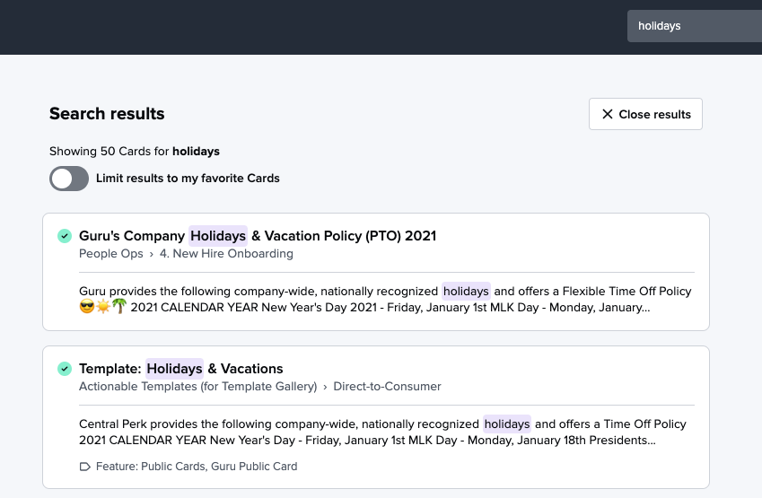
Hi all! We are excited to ✨highlight✨ our newest UI enhancements to the search results page: the addition of snippets and highlighting to make search results more informative.

We've heard consistent feedback in user interviews, NPS comments, and here in the Community (thanks, Craig, for popularizing this item!) that simply providing more information per search result would be helpful for determining which Card is the one you’re actually looking for. Displaying additional information makes it easier to see how search results relate to the search terms provided, and to pick a Card from the results list. You should already see snippets and highlights appearing on your Guru web app search results page.
What are snippets and highlights?
When returning results for a search, Guru will now display continuous snippets of up to 200 characters from the body of a Card based on the content of your search. If there is a section of the Card that’s determined to be particularly relevant, Guru will display that; otherwise, it will display the beginning of the Card content. If content in an attachment or attachment name matches the search terms, a note that “Match found in <file name>” is displayed, like so:

(Learn more about what content Guru indexes for search in our Help Center.)
Up to 3 attachments will be listed for each result in order of how well Guru determines they apply to the search terms. If a Card contains more attachments, there may be matches in those too but they won’t be listed in the search results.
Guru now also highlights, in purple, close matches to the search terms that occur in the title and/or body of a Card. Guru does consider more than matching terms when determining which Cards are relevant for a search, (learn more about how Guru determines relevancy), but we found this approach to be most useful during testing. Guru does not highlight matches in tags, since they are already visually displayed in search results. In most cases, stop words (e.g.: the, with, a, an, at, it, is are...) will not be highlighted, even if they are included in longer search terms like “what are our core values.”
We hope these visual updates improve your search experience and help you find the information you’re looking for even faster! Let us know your favorite thing about snippets and highlights in the comments below.
Resources


