CONTEXT:
Today marks the start of our technology team making the full switch to using Guru. Thank you for the service and I really appreciate the community forum here to ask questions. As an Engineer that loves good design, I would like to leave some personal feedback from my first experience with the web app to see if:
- Are there ways to use Guru I have not yet discovered that would help my experience?
- If not, do other folks see the same UI/UX friction I do and have recommendations?
PROBLEM:
The idea of cards seems so powerful. But the navigation and ways to visually show them leave a lot to be desired. For me it makes using Guru feel sub par to every other modern tool I’ve used like Notion, etc. I can sum these up in a few points:
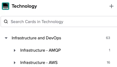
- Navigating collections have no way to visually see all cards at any point of the tree structure.
- The collections “Search Cards in ...” should show card previews in the right panel.
- Cards have different UIs depending on where you see them. Home, Top Search, Collection.
Honestly, navigating Guru feels like I am navigating a Windows NT tree structure vs. a knowledge management center around solid Card components.
RECOMMENDATIONS:
Card’s visual UI component should be a first class citizen thought the experience.
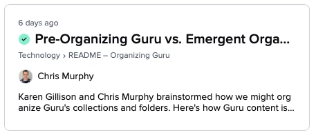
For example, there does seem to be one. I think this card UI (seen below) as seen on the Home Screen is pretty solid. If I were a product engineer for Guru, I would even allow every card to have an og:image and allow every collection context to make decisions on how it could present cards. Like just heading, heading with image, heading, desc, tags. Etc.

But for me, there would be a huge UX win if the “Collections” tree structure allowed clicks to implicitly show all cards in the right hand panel or there was a specific way to link to that sub structure or even pin it as a favorite. Again, that would be useful to me if I could see all the pretty cards.

THOUGHTS:
Perhaps I need to spend some more time learning different ways of using the platform. It could be that either I am not using the platform correctly or that the way we have migrated and/or structured our cards could be improved upon. It is my hope that I can learn about these or that this first-time user experience feedback is helpful to the Guru team(s) or others. Thank you so much y’all again for having this space to talk.
