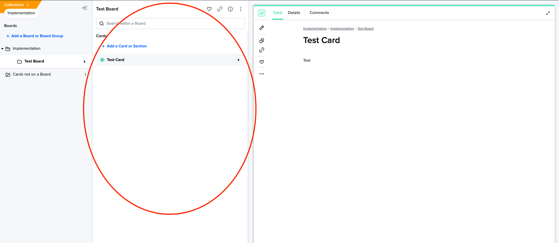
As a new user, I’m finding the main Card section to feel quite cramped - it’s hard to get a good view of the current card so I can digest the material without having to expand the card full screen. Since the card is the main item to be consumed, having it only take up half the page width feels odd. I don’t think I’ll ever create a card title that would be as wide as that current column allows for, but maybe there’s another reason it’s so wide?
On getting into the interface, I expected the width of the card list (not sure the proper name here, but circled below) to be resizable/shrinkable/collapsable, but found there’s no customizing there.
Having the ability to resize the width of that center column/portion would be a big improvement to the UX of this particular view, because it would allow me to remove wasted white space and focus on the card at hand.